SAM
MURPHY
DESIGN
SAM
MURPHY
DESIGN
CLEARING 2022
Telling a story of continuous care
Improving conversion for Clearing's new chronic pain management onboarding
ROLE
Senior Product Designer, partnered with another Senior Designer. Responsible for discovery, narrative, and UX/UI.
GOAL
To onboard patients into a novel care model where success was measured by engagement over payment
OUTCOME
Pivoted to an insurance model and redesigned onboarding to teach users how to engage with continuous care
While most of our patients struggled to afford our existing subscription model, accepting insurance brought more accessible care and a more sustainable business.


68%
drop-off
at payment
Old model
New RTM billing codes
COVID-19 and billing codes for remote-therapeutic monitoring allowed us to accept insurance and pivot from a subscription service.

Ability to
offer
insurance
New model
A new story to tell show
This massive shift brought new challenges and questions: How would we onboard patients skeptical of the healthcare system to something they haven't heard of before? How would we get users on board with a continuous care model that required active participation in order to see results?
We wracked our brains for days... reworking different narratives, but nothing felt right, until it hit me. Our Care-Forward work revealed that our patients struggled to retain information, except when going through sections they needed to interact with. This led to our guiding principle for the flow: show, don’t tell.
What if onboarding was a hands-on demo of the patient experience that taught people how they’d engage as they signed up, increasing both ours and their chances of success from day one?
We aimed to balance building patient trust and setting the business up for success

Swipe


How can you help my type of pain?
We needed to demonstrate our doctors’ credentials so patients could feel relief even before their first visit.

How is this different?
We needed to prove how our method was unique in a crowded landscape.

Why should I trust you?
We needed to address the deep fears of our tech-wary, privacy-conscious old patients.
Common questions/concerns coming from patients on the phone with our Patient Specialist team.

Daily engagement
We needed our patients to check-in consistently in order to keep our costs and fees down, while also keeping them on track and allowing them to see progress in their pain journey.

Virtual care
We needed to prove to patients the quality of care they could get virtually, so we could expand access to those in the rural US, where a trip to a pain specialist often meant a day-long journey.
Specific types of engagement needed from patients, for the business to bill for RTM codes.
START


check-in
Check in; respond based on pain level
expectationS
Talk through steps and
length of onboarding flow

eligibility
Soft insurance check; waitlist if not eligible

pain reporting
Gather pain info, demonstrate specialty
account creation
Collect basic info: email, phone number, password


care reporting
Introduce care team and
demonstrate tailored support
insurance
Gather remaining insurance details and validate

DOCTOR’S visit*
Hear about doctor; schedule visit (conversion)
shipping
Collect address for treatment shipments
app download
How to download and what to expect when getting started
END
Continuous care onboarding user journey; icons represent success moments based on user research and business needs from previous section.
Check-ins
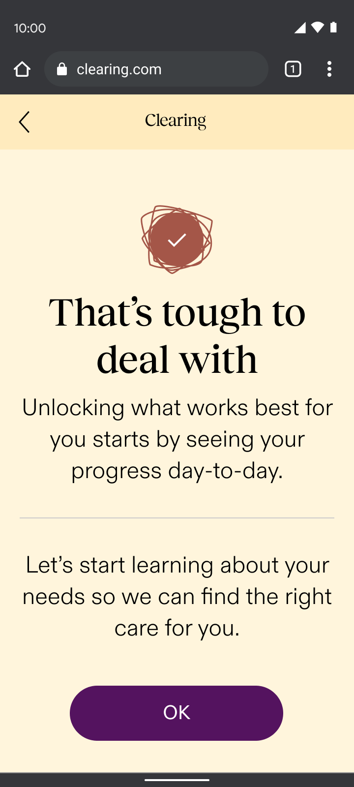
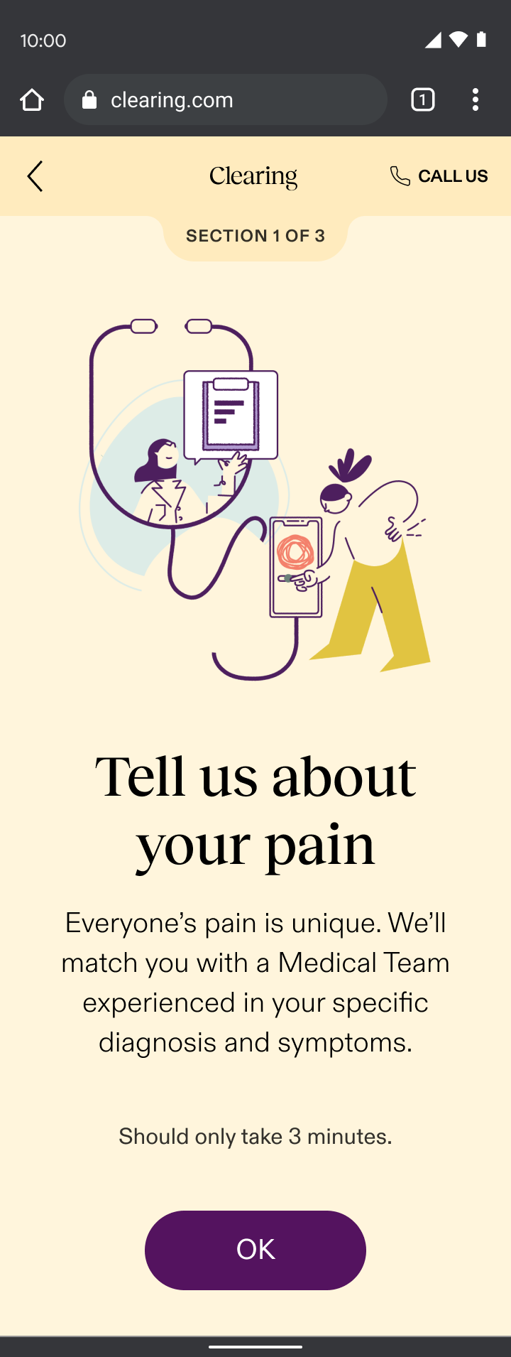
Onboarding began with an immediate check-in, a sample of the new experience. Through my “show, don’t tell” design principle, check-ins:
- Set expectations for what patients could expect daily in the app and how it could help them understand their progress
- Demonstrated empathy with an understanding that people are often coming to us actively in pain
- Paved the way for the daily interactions needed for the required remote-therapeutic monitoring (RTM) that we were billing for
Leveraging insights from our Care-Forward Onboarding, we planned to evolve the check-in experience into a responsive flow based on the user’s pain level. This approach would have tailored the UX based on whether someone felt good in the moment or were actively in pain, demonstrating empathy right away.
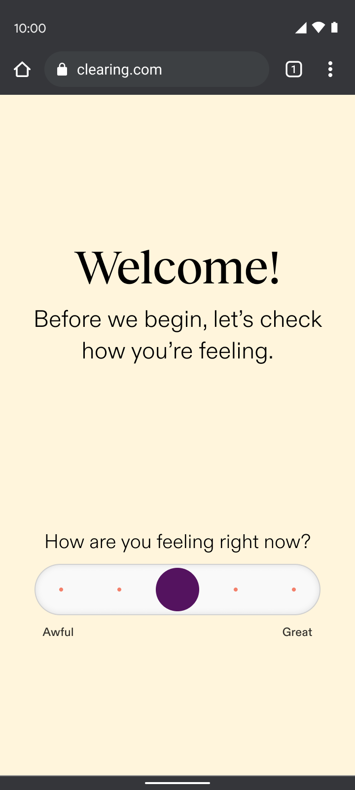
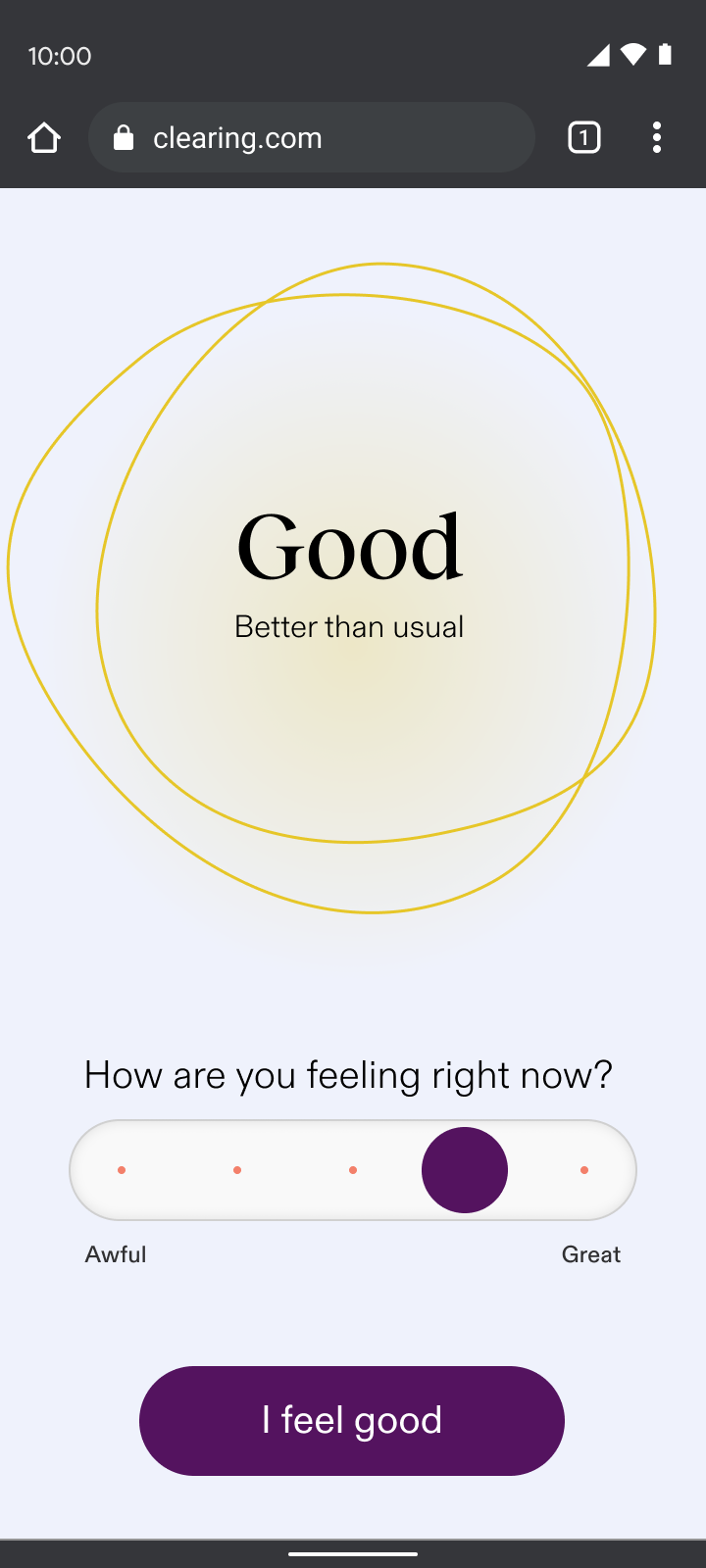
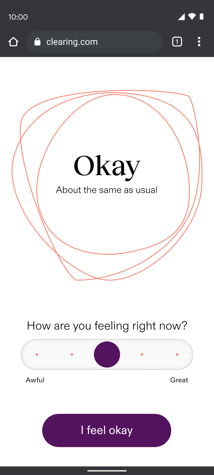
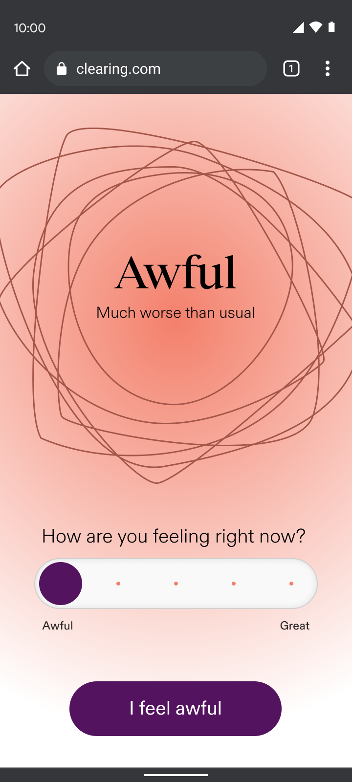
By asking users how they felt, we reduced early drop-off rates from 44% to 15%, nearly tripling engagement from the first interaction.
Change in drop-off after the first section of onboarding compared to the drop-off rate in the Care-Forward flow, a previous iteration.
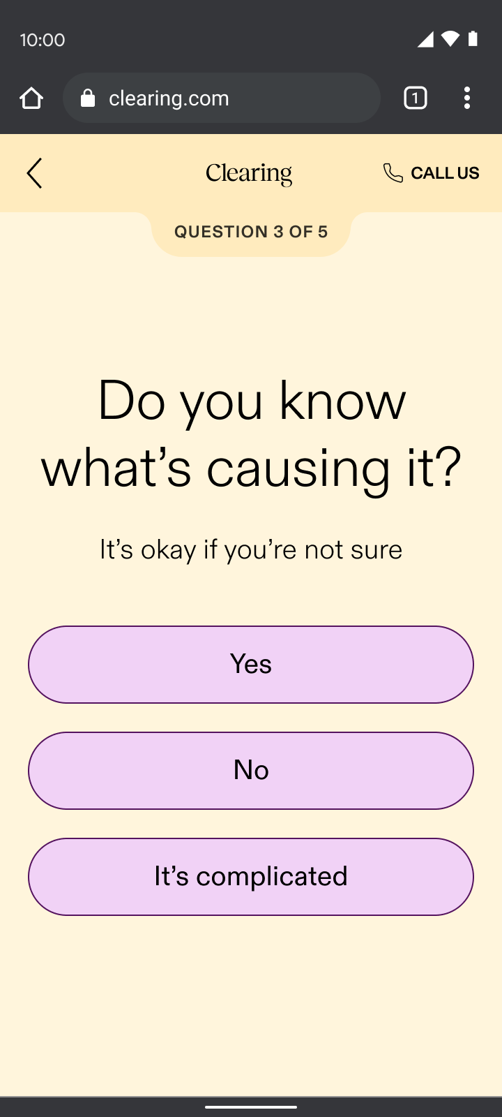
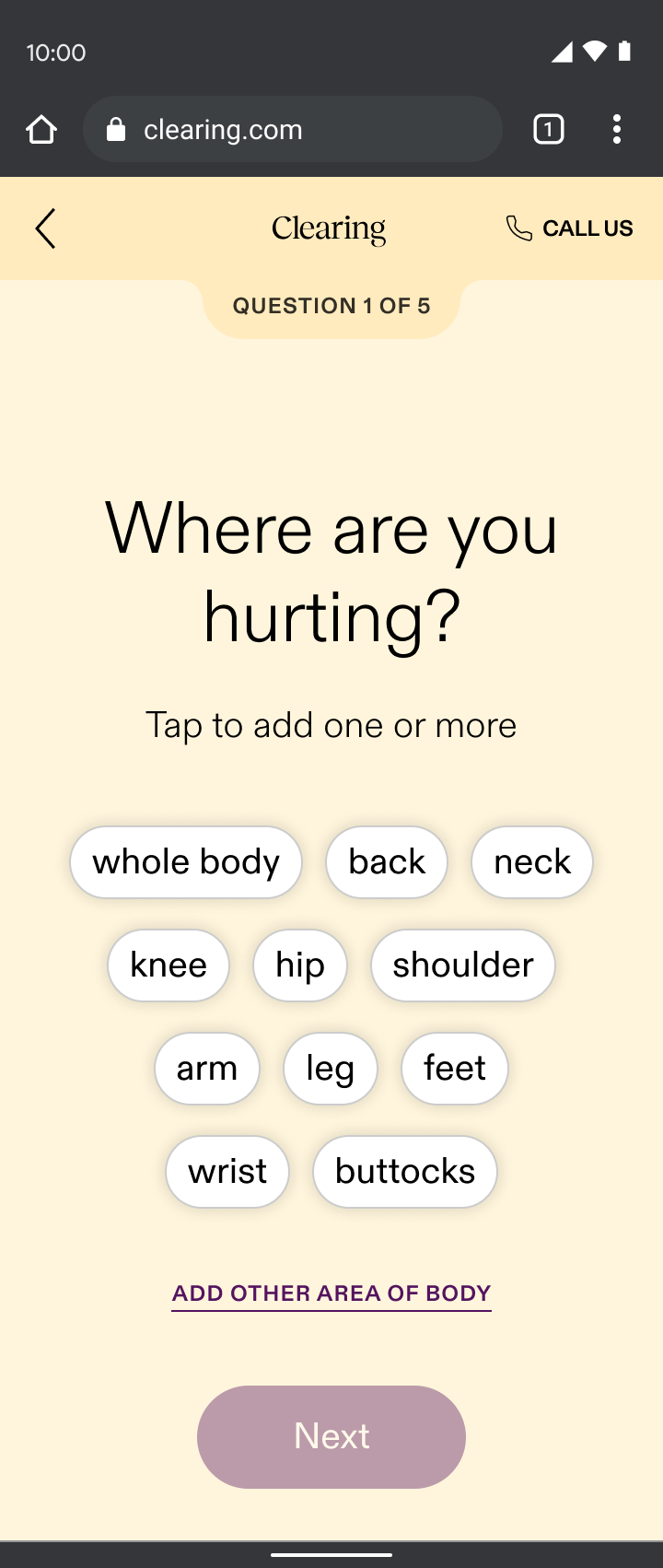
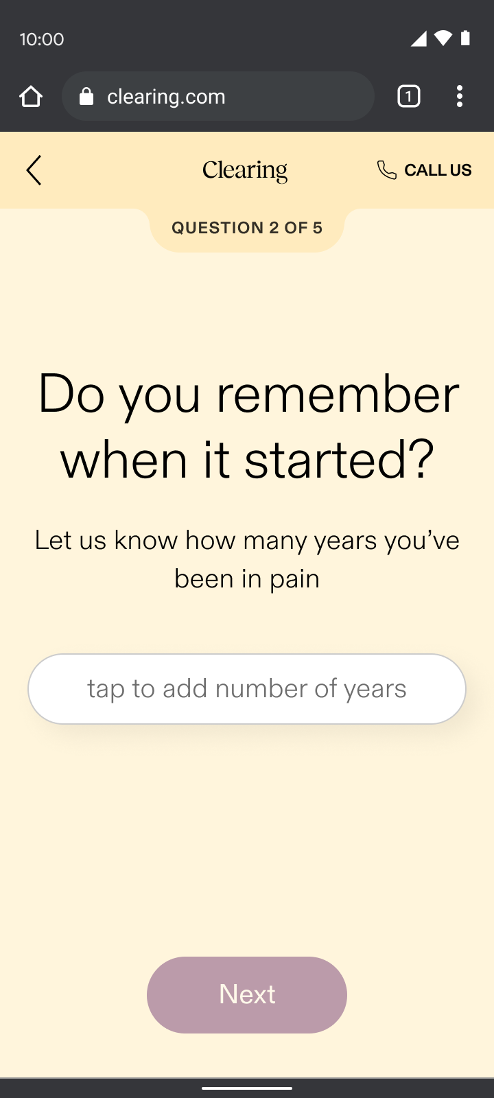
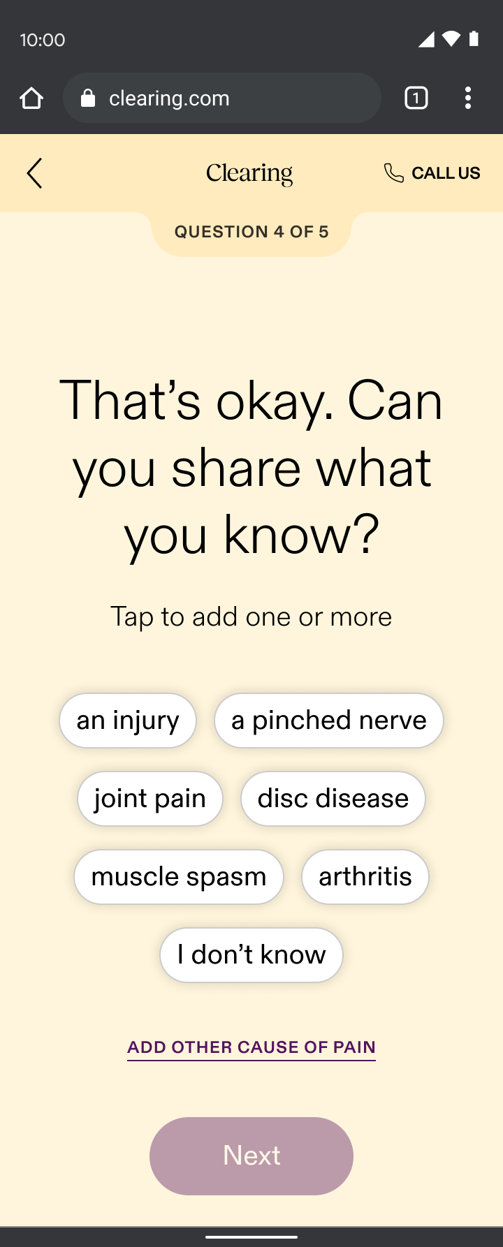
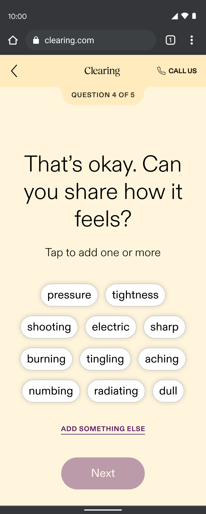
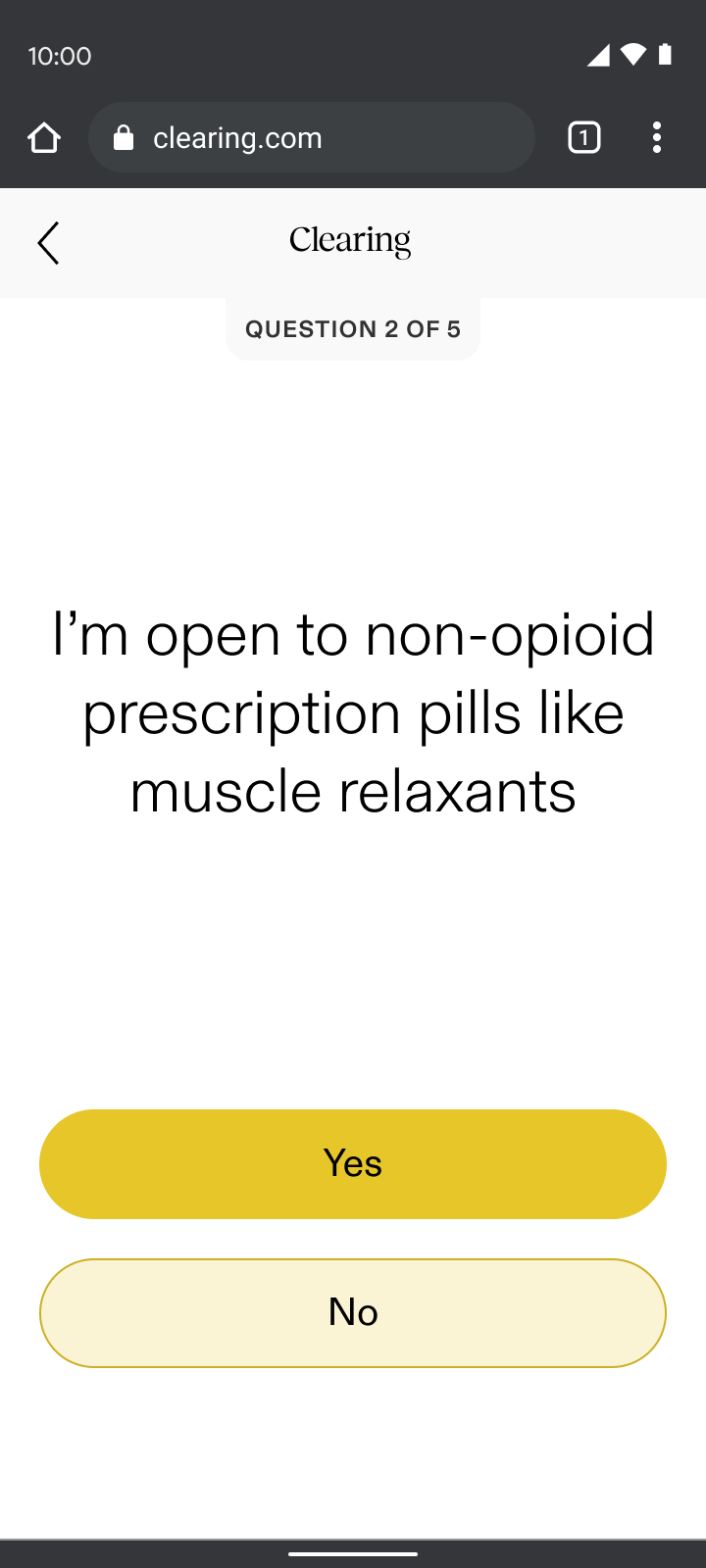
Pain reporting
Pain reporting sat just before sign-up, ensuring we addressed user’s top concerns before asking for their email. Through my “show, don’t tell” design principle, pain reporting:
- Validated the difficult journey many had faced by asking first if they knew their cause of pain while sharing that it’s common if they didn’t
- Demonstrated our specialized approach by displaying personalized selections based on the part of the body they chose and what their pain felt like, which contrasted the generalist doctors many users had typically encountered
By addressing their pain up front, we built enough intrigue for users to take the next step and sign up. It was our way of saying, “we understand your skepticism, we specialize in your type of pain, and we’re here to prove that targeted care can make a difference.”
Yes
No
It’s complicated
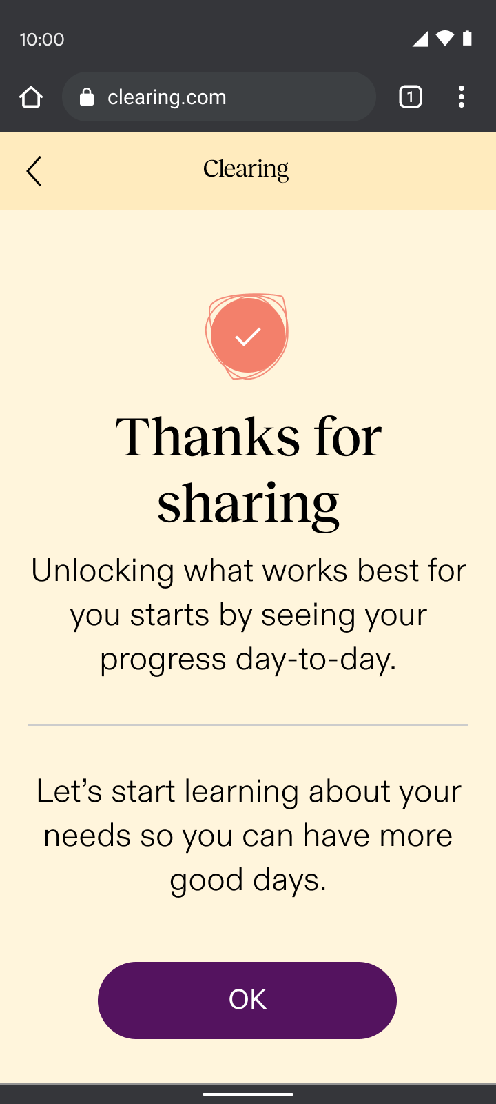
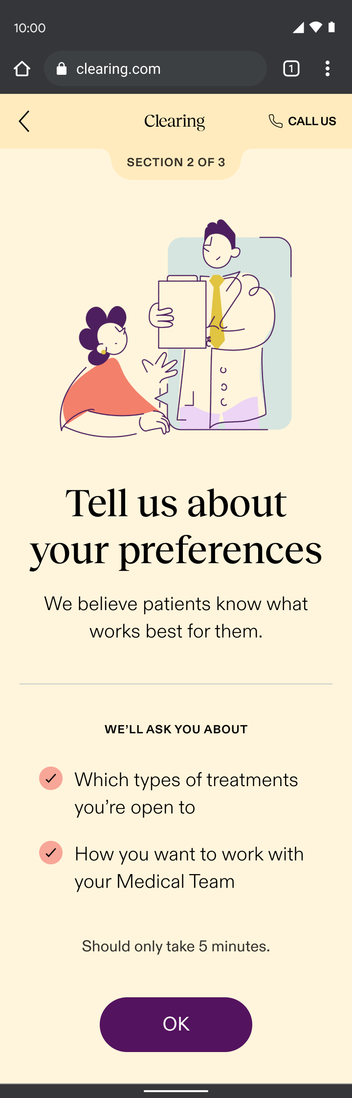
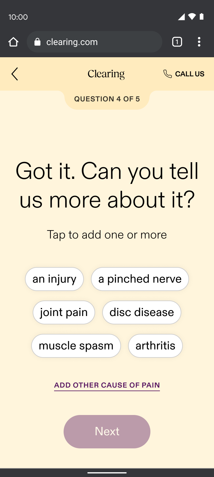
Care reporting
The care reporting section of onboarding introduced users to their dedicated coach and emphasized monthly calls and daily messaging. Through my “show, don’t tell” design principle, care reporting:
- Demonstrated our empathetic difference by asking questions that went beyond physical symptoms, exploring lifestyle and emotional factors that gauged the level of support each user desired
- Showed our understanding of the complexities of chronic pain by asking what other doctors wouldn’t, which contrasted the dismissive experience most chronic pain patients had endured
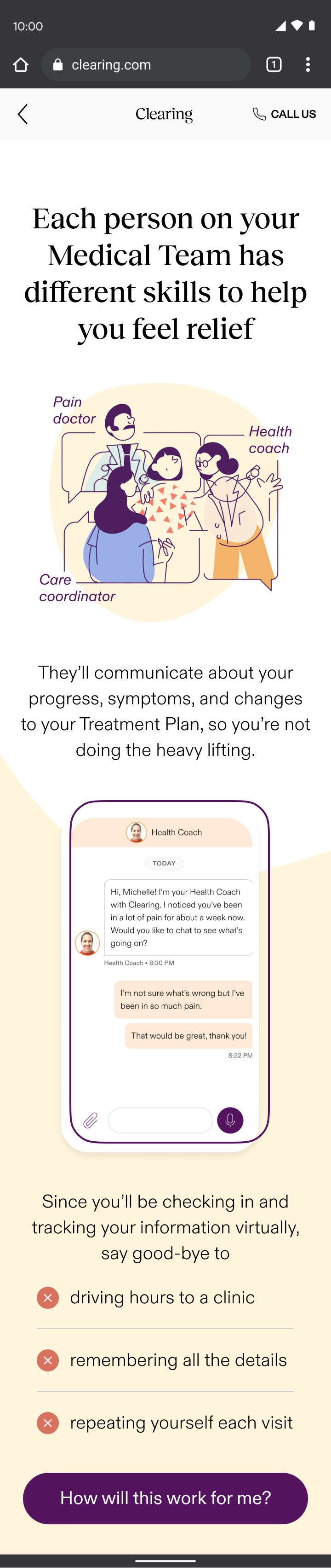
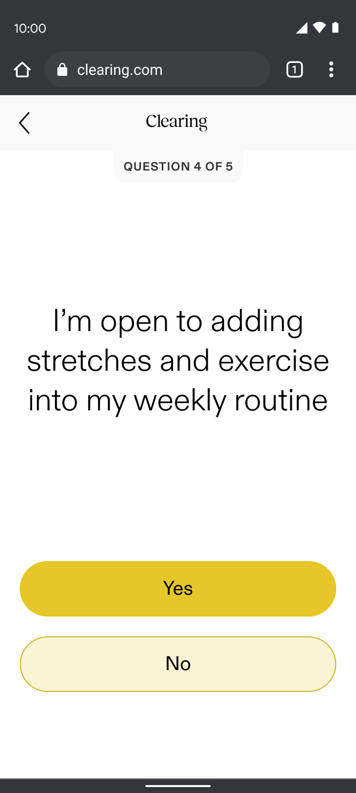
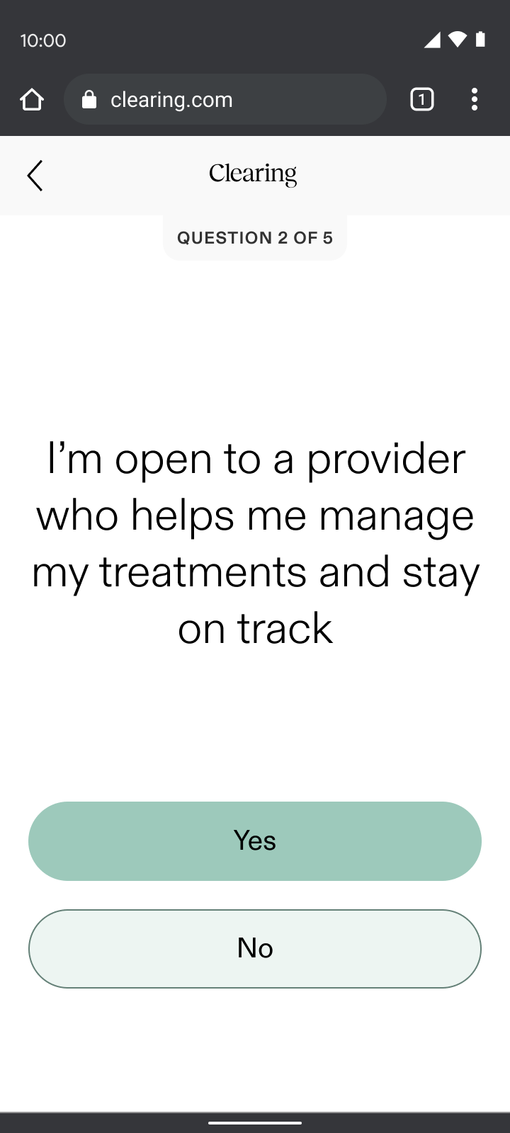
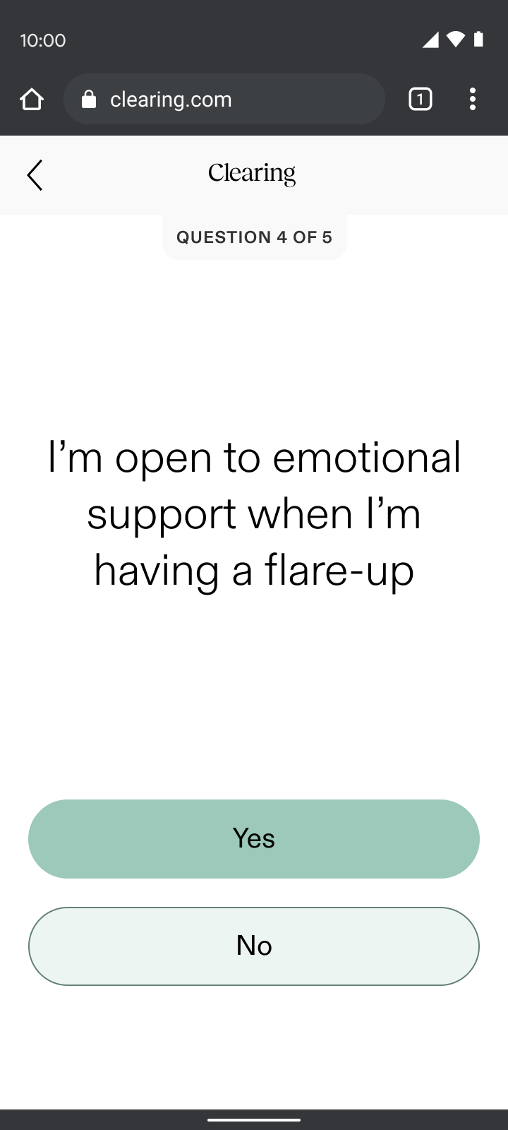

The highlight of this project for me was heading from users when testing the flow. Many were moved to tears by the questions we included. For the first time, they felt their full experience was being acknowledged and it felt like we were really making a difference.
What I learned

Empathy-driven design works
Interactive sections like check-ins, pain reporting, and care reporting saw minimal drop-off compared to our “informational” sections, validating the “show, don’t tell” principle.
Deep user understanding created better connection
User testing confirmed that patients felt supported and validated; and were even willing to go through a longer flow. This reinforced that truly understanding and responding created deeper trust.

Unexpected challenges with insurance integration caused friction
As newcomers to validating insurance, the business faced a steep learning curve in managing complex errors. The initial eligibility check waitlisted a majority of users due to back-end issues, which resulted in significant drop-off at the first half of the flow.
My design partner and I divided and conquered to resolve the bottleneck and our ability to rapidly adapt and work collaboratively was a key strength in addressing these and future challenges.
SAM
MURPHY
DESIGN
SAM
MURPHY
DESIGN
CLEARING 2022
Telling a story of continuous care
Improving conversion for Clearing's new chronic pain management onboarding
ROLE
Senior Product Designer, partnered with another Senior Designer. Responsible for discovery, narrative, and UX/UI.
GOAL
To onboard patients into a novel care model where success was measured by engagement over payment
OUTCOME
Pivoted to an insurance model and redesigned onboarding to teach users how to engage with continuous care
While most of our patients struggled to afford our existing subscription model, accepting insurance brought more accessible care and a more sustainable business.
68%
drop-off
at payment
Old model
New RTM billing codes
COVID-19 and billing codes for remote-therapeutic monitoring allowed us to accept insurance and pivot from a subscription service.
Ability to
offer
insurance
New model
A new story to tell show
This massive shift brought new challenges and questions: How would we onboard patients skeptical of the healthcare system to something they haven't heard of before? How would we get users on board with a continuous care model that required active participation in order to see results?
We wracked our brains for days... reworking different narratives, but nothing felt right, until it hit me. Our Care-Forward work revealed that our patients struggled to retain information, except when going through sections they needed to interact with. This led to our guiding principle for the flow: show, don’t tell.
What if onboarding was a hands-on demo of the patient experience that taught people how they’d engage as they signed up, increasing both ours and their chances of success from day one?
We aimed to balance building patient trust and setting the business up for success
How can you help my type of pain?
We needed to demonstrate our doctors’ credentials so patients could feel relief even before their first visit.
How is this different?
We needed to prove how our method was unique in a crowded landscape.
Why should I trust you?
We needed to address the deep fears of our tech-wary, privacy-conscious old patients.
Common questions/concerns coming from patients on the phone with our Patient Specialist team.
Daily engagement
We needed our patients to check-in consistently in order to keep our costs and fees down, while also keeping them on track and allowing them to see progress in their pain journey.
Virtual care
We needed to prove to patients the quality of care they could get virtually, so we could expand access to those in the rural US, where a trip to a pain specialist often meant a day-long journey.
Specific types of engagement needed from patients, for the business to bill for RTM codes.
START

check-in
Check in; respond based on pain level
expectationS
Talk through steps and
length of onboarding flow

eligibility
Soft insurance check; waitlist if not eligible

pain reporting
Gather pain info, demonstrate specialty
account creation
Collect basic info: email, phone number, password

care reporting
Introduce care team and
educate on tailored support
insurance
Gather remaining insurance details and validate

DOCTOR’S visit*
Hear about doctor; schedule visit (conversion)
shipping
Collect address for treatment shipments

app download
How to download and what to expect when getting started
END


Continuous care onboarding user journey; icons represent success moments based on user research and business needs from previous section.
Check-ins
Onboarding began with an immediate check-in, a sample of the new experience. Through my “show, don’t tell” design principle, check-ins:
- Set expectations for what patients could expect daily in the app and how it could help them understand their progress
- Demonstrated empathy with an understanding that people are often coming to us actively in pain
- Paved the way for the daily interactions needed for the required remote-therapeutic monitoring (RTM) that we were billing for
Leveraging insights from our Care-Forward Onboarding, we planned to evolve the check-in experience into a responsive flow based on the user’s pain level. This approach would have tailored the UX based on whether someone felt good in the moment or were actively in pain, demonstrating empathy right away.
By asking users how they felt, we reduced early drop-off rates from 44% to 15%, nearly tripling engagement from the first interaction.
Change in drop-off after the first section of onboarding compared to the drop-off rate in the Care-Forward flow, a previous iteration.
Pain reporting
Pain reporting sat just before sign-up, ensuring we addressed user’s top concerns before asking for their email. Through my “show, don’t tell” design principle, pain reporting:
- Validated the difficult journey many had faced by asking first if they knew their cause of pain while sharing that it’s common if they didn’t
- Demonstrated our specialized approach by displaying personalized selections based on the part of the body they chose and what their pain felt like, which contrasted the generalist doctors many users had typically encountered
By addressing their pain up front, we built enough intrigue for users to take the next step and sign up. It was our way of saying, “we understand your skepticism, we specialize in your type of pain, and we’re here to prove that targeted care can make a difference.”
Yes
No
It’s complicated
Care reporting
The care reporting section of onboarding introduced users to their dedicated coach and emphasized monthly calls and daily messaging. Through my “show, don’t tell” design principle, care reporting:
- Demonstrated our empathetic difference by asking questions that went beyond physical symptoms, exploring lifestyle and emotional factors that gauged the level of support each user desired
- Showed our understanding of the complexities of chronic pain by asking what other doctors wouldn’t, which contrasted the dismissive experience most chronic pain patients had endured

The highlight of this project for me was heading from users when testing the flow. Many were moved to tears by the questions we included. For the first time, they felt their full experience was being acknowledged and it felt like we were really making a difference.
What I learned
Empathy-driven design works
Interactive sections like check-ins, pain reporting, and care reporting saw minimal drop-off compared to our “informational” sections, validating the “show, don’t tell” principle.
Deep user understanding created better connection
User testing confirmed that patients felt supported and validated; and were even willing to go through a longer flow. This reinforced that truly understanding and responding created deeper trust.
Unexpected challenges with insurance integration caused friction
As newcomers to validating insurance, the business faced a steep learning curve in managing complex errors. The initial eligibility check waitlisted a majority of users due to back-end issues, which resulted in significant drop-off at the first half of the flow.
My design partner and I divided and conquered to resolve the bottleneck and our ability to rapidly adapt and work collaboratively was a key strength in addressing these and future challenges.
SAM
MURPHY
DESIGN
SAM
MURPHY
DESIGN
CLEARING 2022
Telling a story of continuous care
Improving conversion for Clearing's new chronic pain management onboarding
ROLE
Senior Product Designer, partnered with another Senior Designer. Responsible for discovery, narrative, and UX/UI.
GOAL
To onboard patients into a novel care model where success was measured by engagement over payment
OUTCOME
Pivoted to an insurance model and redesigned onboarding to teach users how to engage with continuous care
While most of our patients struggled to afford our existing subscription model, accepting insurance brought more accessible care and a more sustainable business.
68%
drop-off
at payment
Old model
New RTM billing codes
COVID-19 and billing codes for remote-therapeutic monitoring allowed us to accept insurance and pivot from a subscription service.

Ability to
offer
insurance
New model
A new story to tell show
This massive shift brought new challenges and questions: How might we onboard patients skeptical of the healthcare system to something they haven't heard of before? How might we get users on board with a continuous care model that required active participation in order to see results?
We wracked our brains for days... reworking different narratives, but nothing felt right, until it hit me. Our Care-Forward work revealed that our patients struggled to retain information, except when going through sections they needed to interact with. This led to my guiding principle for the project: show, don’t tell.
What if onboarding was a hands-on demo of the patient experience that taught people how they’d engage as they signed up, increasing both ours and their chances of success from day one?
We aimed to balance building patient trust and setting the business up for success
How can you help my type of pain?
We needed to demonstrate our doctors’ credentials so patients could feel relief even before their first visit.
How is this different?
We needed to prove how our method was unique in a crowded landscape.
Why should I trust you?
We needed to address the deep fears of our tech-wary, privacy-conscious older patients.
Common questions/concerns coming from patients on the phone with our Patient Specialist team.
Daily engagement
We needed our patients to check-in consistently in order to keep our costs and fees down, while also keeping them on track and allowing them to see progress in their pain journey.
Virtual care
We needed to prove to patients the quality of care they could get virtually, so we could expand access to those in the rural US, where a trip to a pain specialist often meant a day-long journey.
Specific types of engagement needed from patients, for the business to bill for RTM codes.
START
check-in
Check in; respond based on pain level
expectationS
Talk through steps and
length of onboarding flow
eligibility
Soft insurance check; waitlist if not eligible
pain reporting
Gather pain info, demonstrate specialty

account creation
Collect basic info: email, phone number, password
care reporting
Introduce care team and
educate on tailored support
insurance
Gather remaining insurance details and validate
DOCTOR’S visit*
Hear about doctor; schedule visit (conversion)

shipping
Collect address for treatment shipments
app download
How to download and what to expect when getting started
END
Continuous care onboarding user journey; icons represent success moments based on user research and business needs from previous section.
Check-ins
Onboarding began with an immediate check-in, a sample of the new experience. Through my “show, don’t tell” design principle, check-ins:
- Set expectations for what patients could expect daily in the app and how it could help them understand their progress
- Demonstrated empathy with an understanding that people are often coming to us actively in pain
- Paved the way for the daily interactions needed for the required remote-therapeutic monitoring (RTM) that we were billing for
Leveraging insights from our Care-Forward Onboarding, we planned to evolve the check-in experience into a responsive flow based on the user’s pain level. This approach would have tailored the UX based on whether someone felt good in the moment or were actively in pain, demonstrating empathy right away.

By asking users how they felt, we reduced early drop-off rates from 44% to 15%, nearly tripling engagement from the first interaction.
Change in drop-off after the first section of onboarding compared to the drop-off rate in the Care-Forward flow, a previous iteration.
Pain reporting
Pain reporting sat just before sign-up, ensuring we addressed user’s top concerns before asking for their email. Through my “show, don’t tell” design principle, pain reporting:
- Validated the difficult journey many had faced by asking first if they knew their cause of pain while sharing that it’s common if they didn’t
- Demonstrated our specialized approach by displaying personalized selections based on the part of the body they chose and what their pain felt like, which contrasted the generalist doctors many users had typically encountered
By addressing their pain up front, we built enough intrigue for users to take the next step and sign up. It was our way of saying, “we understand your skepticism, we specialize in your type of pain, and we’re here to prove that targeted care can make a difference.”


Yes
No
It’s complicated
Care reporting
The care reporting section of onboarding introduced users to their dedicated coach and emphasized monthly calls and daily messaging. Through my “show, don’t tell” design principle, care reporting:
- Demonstrated our empathetic difference by asking questions that went beyond physical symptoms, exploring lifestyle and emotional factors that gauged the level of support each user desired
- Showed our understanding of the complexities of chronic pain by asking what other doctors wouldn’t, which contrasted the dismissive experience most chronic pain patients had endured

The highlight of this project for me was hearing from users when testing the flow. Many were moved to tears by the questions we included. For the first time, they felt their full experience was being acknowledged and it felt like we were really making a difference.
What I learned
Empathy-driven design works
Interactive sections like check-ins, pain reporting, and care reporting saw minimal drop-off compared to our “informational” sections, validating the “show, don’t tell” principle.
Deep user understanding created better connection
User testing confirmed that patients felt supported and validated; and were even willing to go through a longer flow. This reinforced that truly understanding and responding created deeper trust.
Unexpected challenges with insurance integration caused friction
As newcomers to validating insurance, the business faced a steep learning curve in managing complex errors. The initial eligibility check waitlisted a majority of users due to back-end issues, which resulted in significant drop-off at the first half of the flow.
My design partner and I divided and conquered to resolve the bottleneck and our ability to rapidly adapt and work collaboratively was a key strength in addressing these and future challenges.