SAM
MURPHY
DESIGN
SAM
MURPHY
DESIGN
THRIVEWORKS 2024-25
Guiding vulnerable individuals through complexity
Redesigning Thriveworks' booking flow to reduce friction and increase conversion by 13%

ROLE
Design Lead responsible for discovery, stakeholder alignment, and end-to-end UX/UI. Partnered with a PM and several engineers to ship a redesigned booking experience.
GOAL
To increase booking conversion — from provider search to session confirmation, by reducing friction across the journey and improve clarity around coverage.
OUTCOME
A reimagined booking flow that increased overall conversion by 13%, drove a 24% lift in return client bookings, and reached a company record of 925 bookings in a week.
My strategic impact

Challenged assumptions about where the problem stemmed from and advocated to shift to a more inclusive approach
Led sessions with billing and experience teams to map root causes of confusion across the user journey
Pushed for moving insurance verification earlier in the flow, addressing users’ primary concern earlier on
Designed a scalable error-handling system that could adapt to different failure states throughout the flow
DISCONNECTED SYSTEMS
The problem
Thriveworks, a 15-year-old mental health company, spent years building systems and processes in silos, overlooking the end-to-end user experience. Users who couldn’t verify their insurance were still allowed to book sessions, which resulted in a broken insurance process—one that overwhelmed our billing team and left clients facing either last-minute cancellations or unexpected charges.
Thriveworks, a 15-year-old mental health company, had built systems and processes in silos over years, creating a disjointed booking experience. The booking flow wasn't a single cohesive experience—it was four different massive ecosystems stitched together, each with its own processes, logic, and codebase. Any change, especially at the biggest drop-off point (insurance verification), would take months of dev work. My team was originally asked to redesign just the insurance step while another pod handled a UI refresh for the rest of the flow.

I quickly realized that insurance verification was where users got stuck—but it wasn't where the problem started. Issues from search, provider selection, and the start of the booking flow were all feeding into insurance failures. This couldn't just be an insurance redesign. We had to shift away from solving problems in silos and move toward a holistic solution.
70% of searches did not include insurance
Most users searched for providers without selecting insurance, investing time in the booking process only to hit a dead end when they found their provider was out-of-network.
Inconsistent language and clinical jargon
Terms like responsible party, primary insured, carrier, and payer added confusion to an already complicated process, often leading to avoidable mistakes.
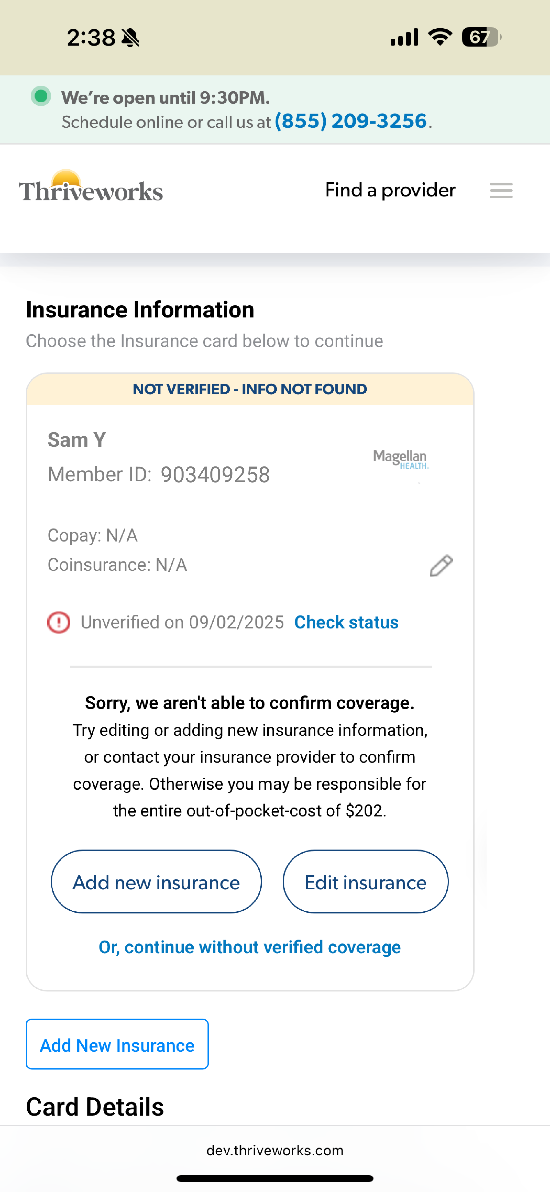
33% of insurance errors resulted in endless loops
Users frequently encountered vague errors that provided no clarity about what was wrong. Left to troubleshoot on their own, most users would try up to 3 times before dropping off.
Sections operated independently
Earlier sections of the flow didn’t communicate with the insurance step which forced users to input repeat information up to three times for multiple pieces of information.
Findings from looking at data, watching session replays, and auditing our existing booking experience.
CONNECTING SILOS
My “guiding” principle
Working closely with the PM and lead engineer, I held working sessions with our billing and customer service teams to map out the entire user experience from search to booking complete, with a special focus on insurance validation. These sessions revealed the most common errors and their root causes, which reinforced how complicated health insurance actually is. It’s confusing by design—every carrier handles information differently, insurance cards have no consistency, and terminology varies across companies.
Instead of pretending it was simple and hoping users would figure it out, we could acknowledge the complexity while actually helping guide them through it.
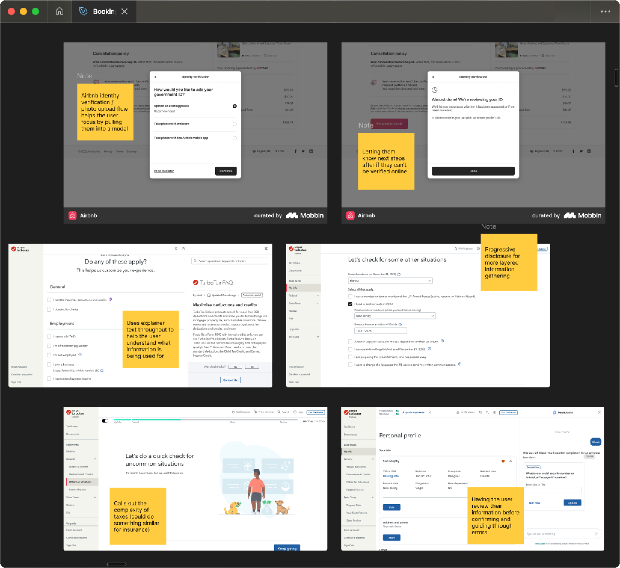
I researched how other companies solved complex problems. From TurboTax, I studied how they explain a confusing topic like taxes with friendly, approachable language while using progressive disclosure to layer information gathering. From Airbnb, I looked at their troubleshooting approach—how they pull users out of the main flow to focus their attention and provide guided assistance when something goes wrong.
GUIDING THROUGH COMPLEXITY
The solutions
Prior to launch
A/B tested solutions in search
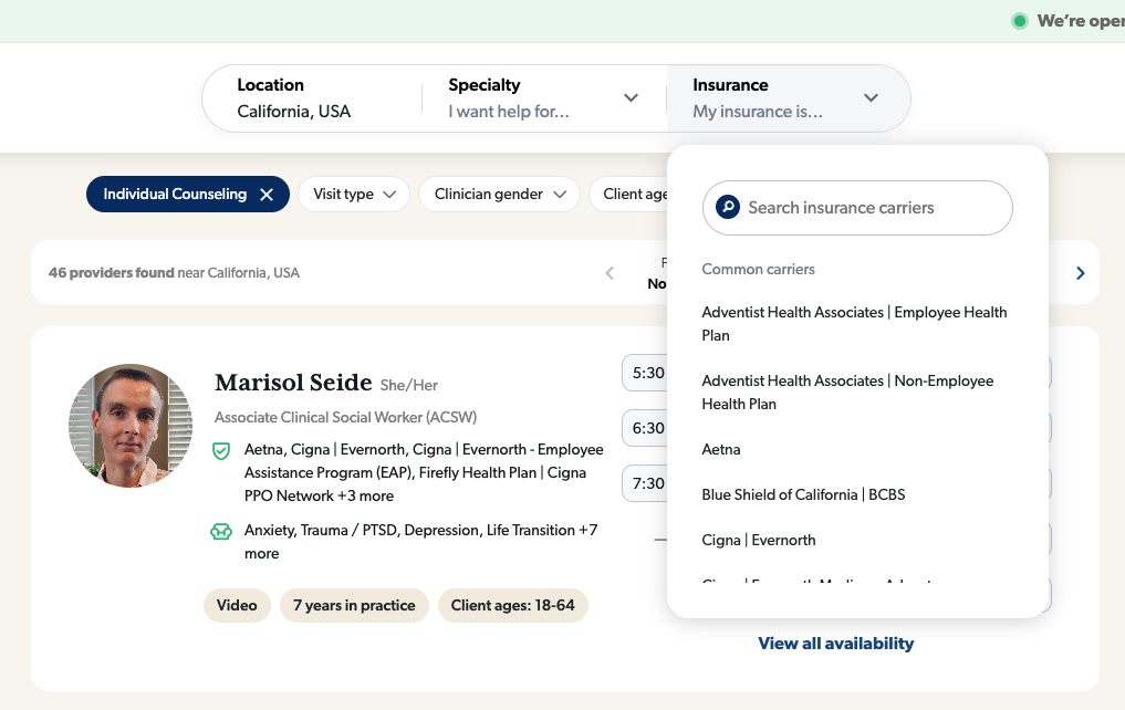
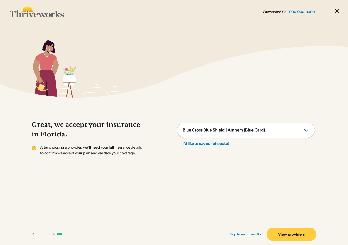
I tested a pre-search questionnaire that guided users through insurance selection, making it more discoverable.
160% increase in search insurance selection
Redirected searches without insurance
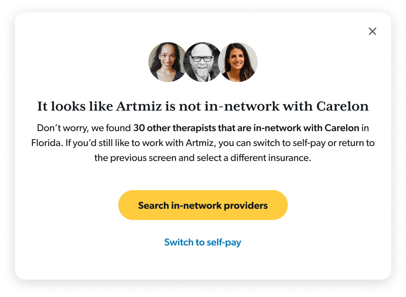
I implemented a way to guide users back to a new provider for those who hadn’t selected insurance
36% of users who got the redirect ultimately booked
Within booking
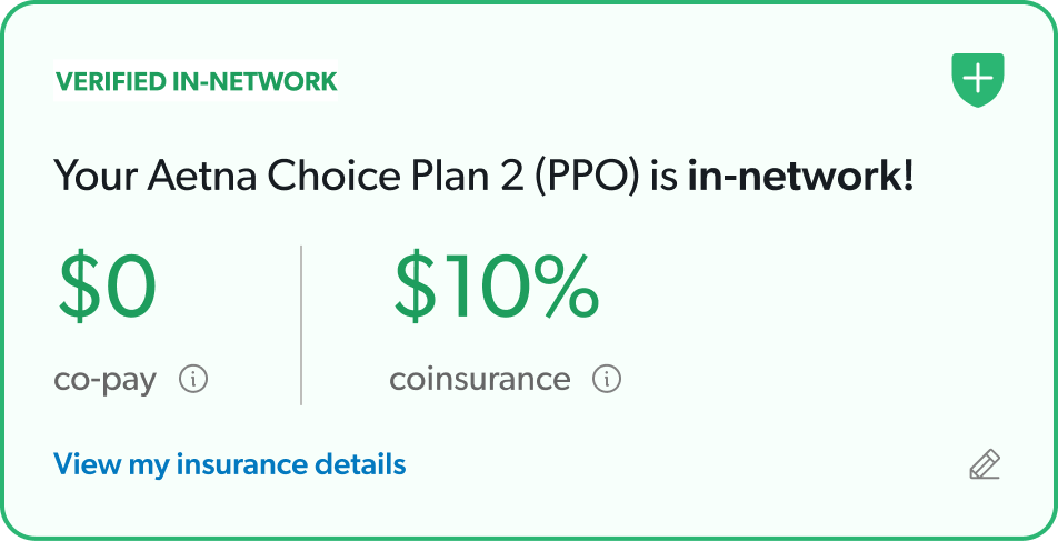
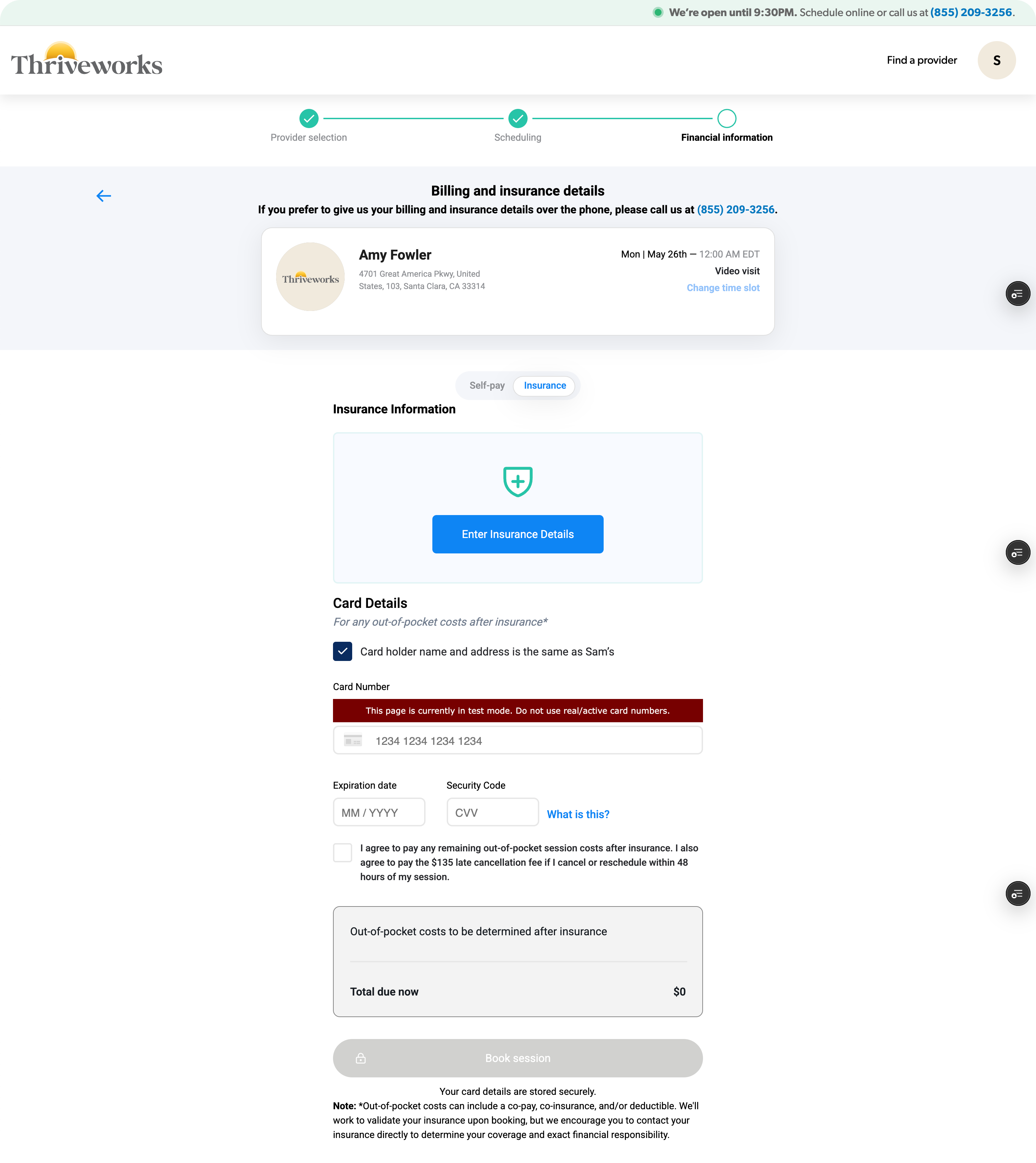
Moved insurance verification up in the flow
Users could understand their coverage status before investing time in the rest of the sections.
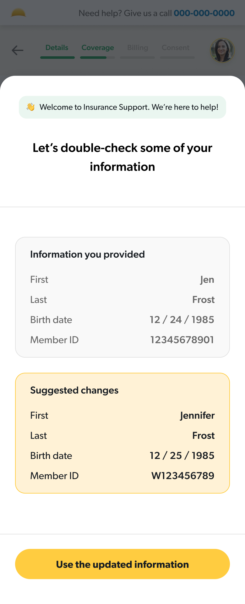
Guided users through errors
I designed a system of guided error states that would work for any failure point at the insurance step.
Used clarifying language to set expectations
I simplified terminology and created an insurance-specific FAQ section to proactively answer common questions.
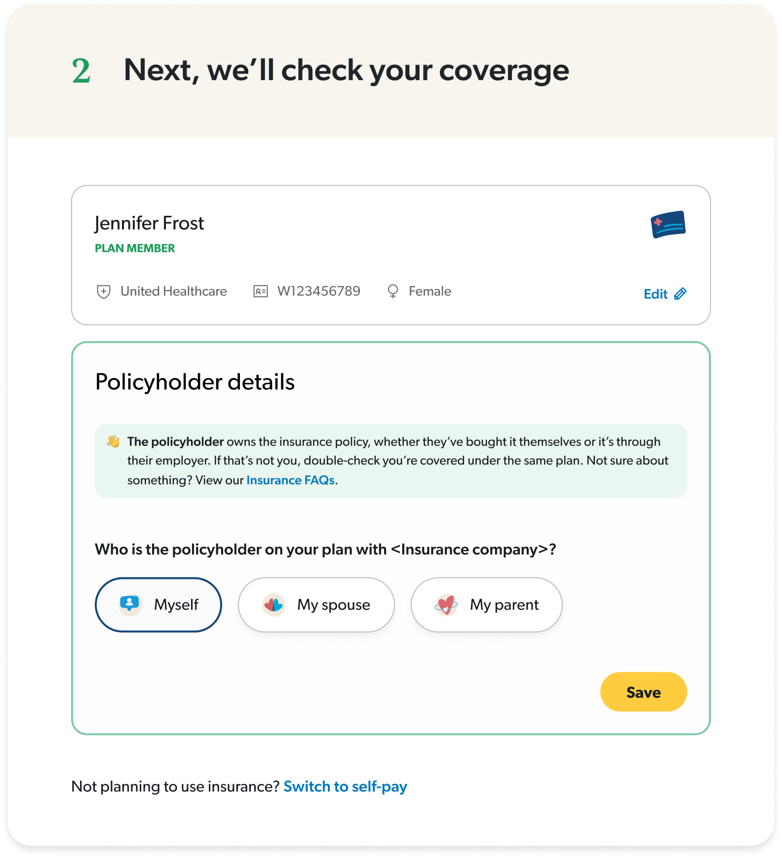
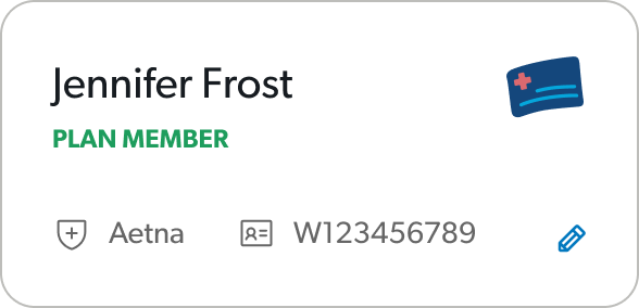
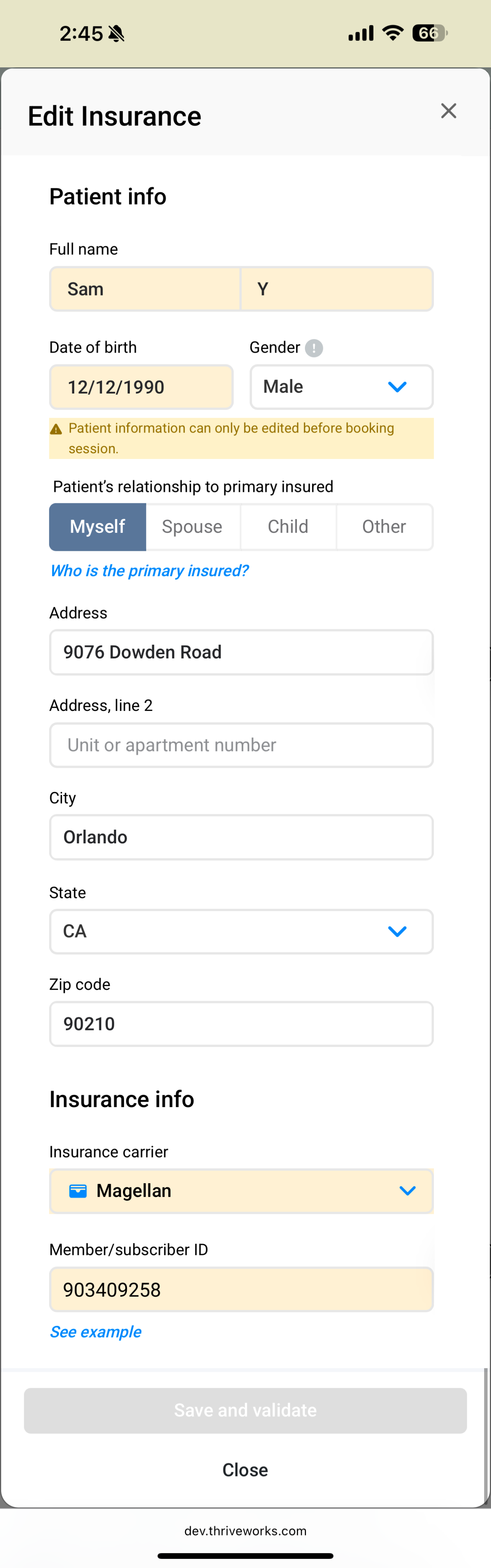
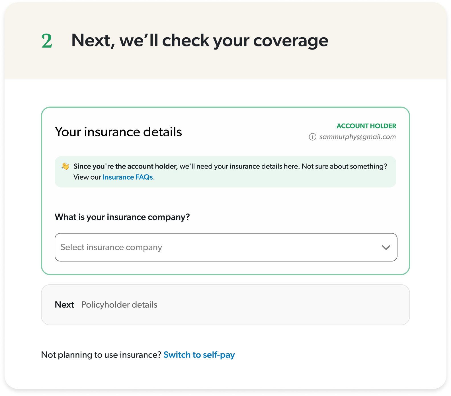
Split insurance and policyholder details
I took a guided approach for more complicated steps to reduce cognitive load.
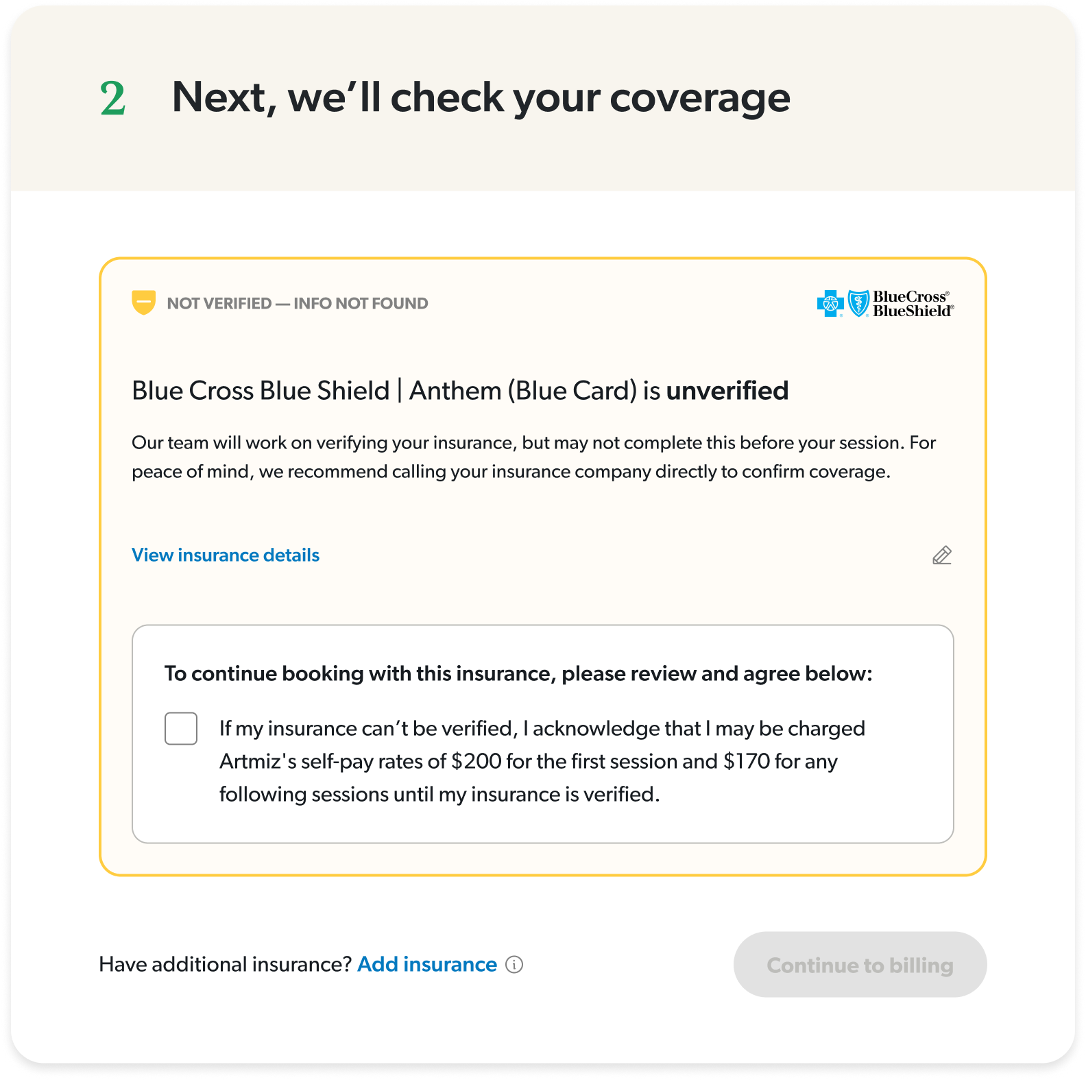
Provided clear messaging about each status
I focused on actionable insights and honest clarifications, so there was no confusion about what to expect once they booked.
Interactive desktop prototype showcasing insurance onboarding flow with built-in troubleshooting for common user errors.
The impact
We started with a canary launch with 100 users to reveal any critical errors or sticking points before moving forward with a 50/50 launch. After one week of testing, we rolled to 100% based on strong positive results.

+13% overall booking conversion
Measured across multiple conversion points: search-to-booking, profile-to-booking, slot selected-to-booking
+24% increase in existing client bookings
Return clients (anyone that’s booked at least one session) were able to complete a booking more easily
925 online bookings in a single week
This is a company record!
+5% bookings despite lower ad spend
Made marketing dollars more efficient

Insurance validation time increased by 50%
An API issues that engineering is investigating but even with this, conversion was not affected
Mobile insurance CVR is flat
Identified as an opportunity to dig deeper and understand how we can optimize mobile even further
While working on this project, I learned that solving the visible problem isn’t always solving the real problem. The team wanted to fix insurance errors, but they were a symptom of a bigger issue: users were lost throughout the entire journey. By reframing the project to a guided experience, I was able to design a more impactful solution that benefitted the business and users more broadly.
SAM
MURPHY
DESIGN
SAM
MURPHY
DESIGN
THRIVEWORKS 2024-25
Guiding vulnerable individuals through complexity
Redesigning Thriveworks' booking flow to reduce friction and increase conversion by 13%
ROLE
Design Lead responsible for discovery, stakeholder alignment, and end-to-end UX/UI. Partnered with a PM and several engineers to ship a redesigned booking experience.
GOAL
To increase booking conversion — from provider search to session confirmation, by reducing friction across the journey and improve clarity around coverage.
OUTCOME
A reimagined booking flow that increased overall conversion by 13%, drove a 24% lift in return client bookings, and reached a company record of 925 bookings in a week.
My strategic impact
Challenged assumptions about where the problem stemmed from and advocated to shift to a more inclusive approach
Led sessions with billing and experience teams to map root causes of confusion across the user journey
Pushed for moving insurance verification earlier in the flow, addressing users’ primary concern earlier on
Designed a scalable error-handling system that could adapt to different failure states throughout the flow
DISCONNECTED SYSTEMS
The problem
Thriveworks, a 15-year-old mental health company, spent years building systems and processes in silos, overlooking the end-to-end user experience. Users who couldn’t verify their insurance were still allowed to book sessions, which resulted in a broken insurance process—one that overwhelmed our billing team and left clients facing either last-minute cancellations or unexpected charges.
Thriveworks, a 15-year-old mental health company, had built systems and processes in silos over years, creating a disjointed booking experience. The booking flow wasn't a single cohesive experience—it was four different massive ecosystems stitched together, each with its own processes, logic, and codebase. Any change, especially at the biggest drop-off point (insurance verification), would take months of dev work. My team was originally asked to redesign just the insurance step while another pod handled a UI refresh for the rest of the flow.

I quickly realized that insurance verification was where users got stuck—but it wasn't where the problem started. Issues from search, provider selection, and the start of the booking flow were all feeding into insurance failures. This couldn't just be an insurance redesign. We had to shift away from solving problems in silos and move toward a holistic solution.
70% of searches did not include insurance
Most users searched for providers without selecting insurance, investing time in the booking process only to hit a dead end when they found their provider was out-of-network.
Inconsistent language and clinical jargon
Terms like responsible party, primary insured, carrier, and payer added confusion to an already complicated process, often leading to avoidable mistakes.
33% of insurance errors resulted in endless loops
Users frequently encountered vague errors that provided no clarity about what was wrong. Left to troubleshoot on their own, most users would try up to 3 times before dropping off.
Sections operated independently
Earlier sections of the flow didn’t communicate with the insurance step which forced users to input repeat information up to three times for multiple pieces of information.
Findings from looking at data, watching session replays, and auditing our existing booking experience.
CONNECTING SILOS
My “guiding” principle
Working closely with the PM and lead engineer, I held working sessions with our billing and customer service teams to map out the entire user experience from search to booking complete, with a special focus on insurance validation. These sessions revealed the most common errors and their root causes, which reinforced how complicated health insurance actually is. It’s confusing by design—every carrier handles information differently, insurance cards have no consistency, and terminology varies across companies.
Instead of pretending it was simple and hoping users would figure it out, we could acknowledge the complexity while actually helping guide them through it.
I researched how other companies solved complex problems. From TurboTax, I studied how they explain a confusing topic like taxes with friendly, approachable language while using progressive disclosure to layer information gathering. From Airbnb, I looked at their troubleshooting approach—how they pull users out of the main flow to focus their attention and provide guided assistance when something goes wrong.
GUIDING THROUGH COMPLEXITY
The solutions
Prior to launch
A/B tested solutions in search
I tested a pre-search questionnaire that guided users through insurance selection, making it more discoverable.
160% increase in search insurance selection
Redirected searches without insurance
I implemented a way to guide users back to a new provider for those who hadn’t selected insurance
36% of users who got the redirect ultimately booked
Within booking
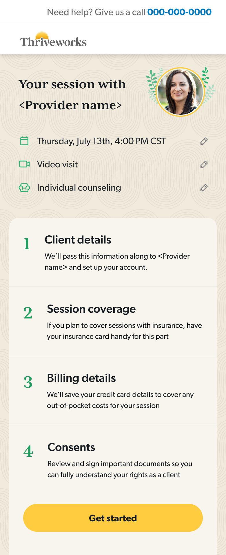
Moved insurance verification up in the flow
Users could understand their coverage status before investing time in the rest of the sections.
Guided users through errors
I designed a system of guided error states that would work for any failure point at the insurance step.
Used clarifying language to set expectations
I simplified terminology and created an insurance-specific FAQ section to proactively answer common questions.
Split insurance and policyholder details
I took a guided approach for more complicated steps to reduce cognitive load.
Provided clear messaging about each status
I focused on actionable insights and honest clarifications, so there was no confusion about what to expect once they booked.
Interactive desktop prototype showcasing insurance onboarding flow with built-in troubleshooting for common user errors.
The impact
We started with a canary launch with 100 users to reveal any critical errors or sticking points before moving forward with a 50/50 launch. After one week of testing, we rolled to 100% based on strong positive results.

+13% overall booking conversion
Measured across multiple conversion points: search-to-booking, profile-to-booking, slot selected-to-booking
+24% increase in existing client bookings
Return clients (anyone that’s booked at least one session) were able to complete a booking more easily
925 online bookings in a single week
This is a company record!
+5% bookings despite lower ad spend
Made marketing dollars more efficient
Insurance validation time increased by 50%
An API issues that engineering is investigating but even with this, conversion was not affected
Mobile insurance CVR is flat
Identified as an opportunity to dig deeper and understand how we can optimize mobile even further
While working on this project, I learned that solving the visible problem isn’t always solving the real problem. The team wanted to fix insurance errors, but they were a symptom of a bigger issue: users were lost throughout the entire journey. By reframing the project to a guided experience, I was able to design a more impactful solution that benefitted the business and users more broadly.
SAM
MURPHY
DESIGN
SAM
MURPHY
DESIGN
THRIVEWORKS 2024-25
Guiding vulnerable individuals through complexity
Redesigning Thriveworks' booking flow to reduce friction and increase conversion by 13%
ROLE
Design Lead responsible for discovery, stakeholder alignment, and end-to-end UX/UI. Partnered with a PM and several engineers to ship a redesigned booking experience.
GOAL
To increase booking conversion — from provider search to session confirmation, by reducing friction across the journey and improve clarity around coverage.
OUTCOME
A reimagined booking flow that increased overall conversion by 13%, drove a 24% lift in return client bookings, and reached a company record of 925 bookings in a week.
My strategic impact
Challenged assumptions about where the problem stemmed from and advocated to shift to a more inclusive approach
Led sessions with billing and experience teams to map root causes of confusion across the user journey
Pushed for moving insurance verification earlier in the flow, addressing users’ primary concern earlier on
Designed a scalable error-handling system that could adapt to different failure states throughout the flow
DISCONNECTED SYSTEMS
The problem
Thriveworks, a 15-year-old mental health company, spent years building systems and processes in silos, creating a disjointed booking experience. The flow was essentially four different ecosystems stitched together, each with its own processes, logic, and team. Any change—especially at insurance verification, the biggest drop-off point—would take weeks, sometimes months of dev work.
The original ask was split across three efforts: my team would tackle insurance verification, a group of engineers would refactor the flow so each section could communicate with the others, and another design pod would refresh the UI to match our brand.

I quickly realized that insurance verification was where users got stuck—but it wasn't where the problem started. Issues from search, provider selection, and the start of the booking flow were all feeding into insurance failures. This couldn't just be an insurance redesign. We had to shift away from solving problems in silos and move toward a holistic solution.
70% of searches did not include insurance
Most users searched for providers without selecting insurance, investing time in the booking process only to hit a dead end when they found their provider was out-of-network.
Inconsistent language and clinical jargon
Terms like responsible party, primary insured, carrier, and payer added confusion to an already complicated process, often leading to avoidable mistakes.
33% of insurance errors resulted in endless loops
Users frequently encountered vague errors that provided no clarity about what was wrong. Left to troubleshoot on their own, most users would try up to 3 times before dropping off.
Sections operated independently
Earlier sections of the flow didn’t communicate with the insurance step which forced users to input repeat information several times at multiple steps.
Findings from looking at data, watching session replays, and auditing our existing booking experience.
CONNECTING SILOS
My “guiding” principle
Working closely with the PM and lead engineer, I held working sessions with our billing and customer service teams to map out the entire user experience from search to booking complete, with a special focus on insurance validation. These sessions revealed the most common errors and their root causes, which reinforced how complicated health insurance actually is. It’s confusing by design—every carrier handles information differently, insurance cards have no consistency, and terminology varies across companies.
Instead of pretending it was simple and hoping users would figure it out, we could acknowledge the complexity while actually helping guide them through it.
I researched how other companies solved complex problems. From TurboTax, I studied how they explain a confusing topic like taxes with friendly, approachable language while using progressive disclosure to layer information gathering. From Airbnb, I looked at their troubleshooting approach—how they pull users out of the main flow to focus their attention and provide guided assistance when something goes wrong.
GUIDING THROUGH COMPLEXITY
The solutions
Prior to launch
A/B tested solutions in search
I tested a pre-search questionnaire that guided users through insurance selection, making it more discoverable.
160% increase in search insurance selection
Redirected searches without insurance
I implemented a way to guide users back to a new provider for those who hadn’t selected insurance
36% of users who got the redirect ultimately booked
Within booking
Moved insurance verification up in the flow
Users could understand their coverage status before investing time in the rest of the sections.
Guided users through errors
I designed a system of guided error states that would work for any failure point at the insurance step.
Used clarifying language to set expectations
I simplified terminology and created an insurance-specific FAQ section to proactively answer common questions.
Split insurance and policyholder details
I took a guided approach for more complicated steps to reduce cognitive load.
Provided clear messaging about each status
I focused on actionable insights and honest clarifications, so there was no confusion about what to expect once they booked.
Interactive desktop prototype showcasing insurance onboarding flow with built-in troubleshooting for common user errors.
The impact
We started with a canary launch with 100 users to reveal any critical errors or sticking points before moving forward with a 50/50 launch. After one week of testing, we rolled to 100% based on strong positive results.

+13% overall booking conversion
Measured across multiple conversion points: search-to-booking, profile-to-booking, slot selected-to-booking
+24% increase in existing client bookings
Return clients (anyone that’s booked at least one session) were able to complete a booking more easily
925 online bookings in a single week
A company record!
+5% bookings despite lower ad spend
Made marketing dollars more efficient
Insurance validation time increased by 50%
An API issue that engineering is investigating but even with this, conversion was not affected
Mobile insurance CVR is flat
Identified as an opportunity to dig deeper and understand how we can optimize mobile even further
While working on this project, I learned that solving the visible problem isn’t always solving the real problem. The team wanted to fix insurance errors, but they were a symptom of a bigger issue: users were lost throughout the entire journey. By reframing the project to a guided experience, I was able to design a more impactful solution that benefitted the business and users more broadly.